
The Q magazine uses 3 simple main colours for its text which are red, white and black. This keeps the magazine simple and plain and easy to read. The magazine also uses the same font throughout the front cover which means anyone can read it and its not too confusing. The front cover consists of one main imagine which takes up half of the page. This focuses well on just the artist and makes the audience understand what the main topic of the magazine will be. Q also use a lot of other writing on one side to introduce topics that will be included in the magazine which are organised well on the left hand side of the magazine.
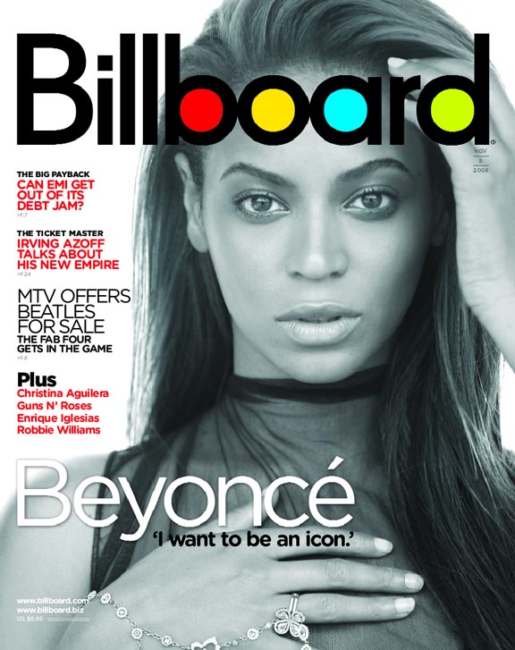
Billboard uses 3 main text colours just like Q to attract the audience and keep it simple. However they use some more colours for their magazine title. By using vibrant colours, they stand out in front cover more therefore if you seen the magazine on a shelf in a shop you will be able to recognise the magazine quicker than any other one because of the different colours in the tittle. You may also argue that it might attract younger readers (teenagers). Billboard uses one main image to with the text which says the name of the artist incase people don't know who Beyonce is. By using one image on the front cover, this draws all the attention to the one artist and what the main topic of the magazine will be which mentioned will be about Beyonce wanting to be an icon. Similarly, Billboard has additional text on the left had side of the page about the other topics that will be mentioned the magazine. However the text is much smaller in order for the readers to focus on the main topic.

Rolling stones also uses one main image on its front cover, however it is positioned in the middle of the magazine instead of the size like on the other ones. Similarly, the front cover consists of a lot of text which is more colourful than all the other covers. The magazine uses bright colours in order for the text to stand out and appeal to readers. The main text stand out on the cover which helps the reader understand what the main topic of the magazine is.

The magazine uses 4 different images n its contents page in order to demonstrate a wife range of music types and attract different readers. The picture of JAY-Z takes up the most space on the page which hints that the magazine has an exclusive section on him compared to the rest of the artists which have smaller pictures or just written in text. Compared to JAY-Z 's imagine, Lady Gaga and Dave Grohl have different type of images. At the bottom of the page there are screen shoots of the double page spreads on Lady Gaga and Dave Grohl which is different to the main image on the contents page, however it gives the readers an inside to what they can expect in the magazine. The logo of Q is also shown on the page to remind the readers what magazine they are reading. However the page number (50) is larger than the actual logo which suggest that JAY-Z is the most important on the contents page.

Billboard uses a plain white background to show professionalism and make the title and the images stand out more. They use a lot of imagines to show the audience reading the magazine a little preview of the biggest topics in the magazine and where they could find them. The use of images draws attention to the readers eye which makes them more likely to look at it rather than searching through the text. Billboard has also included a top chart which makes their magazine unique and adds value to its magazine or brand image. they also use black text for the normal writing which is a normal thing and then use bright blue font for the headings to stand out. They do this because instead of reading everything it may be easier for the readers to just read the most important bits and see if they like it or not and its also more catchy.

Rolling Stone uses one main image on its front cover and present simplicity that way. The magazine uses similar colours to its front cover in order to trademark its own magazine if someone sees it, they will know it is rolling stone. At the top of the contents page rolling stone puts the issue number of the magazine and its slogan which makes the magazine more rememberable. RS use the red for its titles as it is the colour used for the magazine title and they use it for the headings on their magazine page to show continuity of the importance of the colour red. The red also stands out from the page which makes the headings stand out which makes the reader see the information easier.

The use of one image shows traditional conventions of a double page spread and it also attracts the readers eyes to who the article is about. The imagine has been clearly edited as there is a contrasting fade of blue and red in the background which may made the image stand out more or made it more appealing in order to attract jay-z 's fans to read the whole article. On the imagine, in the right hand bottom corner there is a text. This is a quote from the article which tells the readers what the article could be about and encourages to make the decision if they want to read the article or not. On the text side of the double page spread there is a massive letter J in red over the text which is a traditional part of Q magazines double page spread. This letter is the first letter of Jay- z 's name and also makes it stand out on the page catching the readers attention. The 3 main colours used are white, black and red which are the usual colours used throughout the magazine. Q seem to keep the colours simple and only use red to make the texts stand out. The font of the text is the same throughout which shows professionalism and also the size of the text is the same through out which is quite small but means it fits all on one page.

Billboard magazine also use one main image on its double page spread which shows the traditional conventions and attracts the readers vision to look at the imagine which may get them interested in reading the magazine. The image uses a simple grey background which may mean it was just edited in to match with the rest of the double page spread. In the top right corner of the image there is a small text which says "woman of the year" which is hard to see and does not stand out much. The title of the double page spread stands out clearly as it takes up about one third of the page and is much bigger than any other text on the page. By this, the text catches the readers attention which makes them wanna read on and understand it. Billboard uses 2 main colours which is a vibrant purple on the background which allows the second colour which is white to be used as the colour of the text. The main text is small but the same size throughout which shows professionalism throughout the double page spread and magazine.

Rolling stone's double page spread differs from the other ones analysed. This is because it is not a traditional convention of a double page spread where an image covers one side of the page. Firstly, Rolling Stone has its magazine title at the top of the double page spread which shows professionalism and they also include the issue number of the magazine and the date so the reader always knows what they are reading and it is also good for advertising. The image is positioned along the top half of the two pages with a gap for the text on the left hand side which shows their layout as unique as no other magazines do it much which may show how the magazine is unique and easy to recognise even though even though the magazine title is at the top of the page. The image has been clearly edited as it has a black and white filter which stops it from standing out so the readers can concentrate on the article instead of the image or the headings. The double page spread is quite simple as it only uses the black and white colours mainly without the exception of the rolling stone heading at the top of the page and the bit of green in the middle of the article to made a quote stand out, but this is the only touch of colour used within the two pages. The font is small and the same throughout the double page spread which shows simplicity throughout the pages.
No comments:
Post a Comment