Bauer
Who are the company?
Bauer Media UK is an entertainment network of iconic, multi-platform brands. It is a private limited company which is Europe’s largest media group. The company operates in 19 different countries including England, Germany, USA and Australia. It has around 11,000 employees worldwide.
What is their company history?
The business started up at a printing plant to produce business cards. Soon the local advertising newspaper ‘Rothenburgersorter Zeitung’ was also launched. This was followed for some magazines to be launched and one of them was a radio magazine which sold half a million copies weekly which came out in 1926. In the 1970s the first ever women's magazine came out. Bauer later bought shares in TV broadcaster RLT III and radio station Radio Hamburg.
What publications do they manage?
Bauer own 107 different publications. They are usually split into 4 different categories: Magazine, Radio, Digital and TV. Some examples of their magazines are: Empire, Closer, Heat, Q and Trail. Bauer also own 4 radio stations which are: Kiss, Absolute radio, Magic and Bauer City. They own TV channels like: 4music, the box and heat. Some of their digital publications include: Bike, Car, Digital Photo, Kisstory and Mojo.
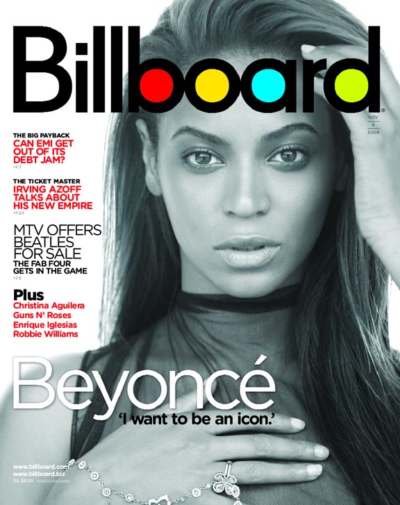
Examples of magazine covers
Q magazine is a music magazine published by Bauer Media. It was first founded in 1986 by 2 people. Its target audience are music lovers which are an older generation as that's what the founders aimed for. Q uses one main picture instead of loads of different pictures. It uses a lot of texts on its front cover but only use 3 main colours which are; white, red and black.
Closer magazine specialises in celebrity news and gossip. It was first funded in 2005. Its target audience is anyone from late teens to late adults. It would mostly target women rather than men. Closer magazine uses a lot more pictures on their front cover and uses a lot less writing and more colours.
Future PLC
Who are the company?
Future are an international publishing group and a leading digital business. It publishes more than 30 magazines in areas such as video games, technology, films, photography and sport.
What is their company history?
It was first founded in 1985 with a single magazine called “Amstrad Action”. In 1989 Future became Britain’s leading publisher of newsstand computer magazines. By 1992, Future has got 21 magazines and had 55,000 people attend its first event ‘The Future Entertainment Show at Earls Court, London. In 2016 it got a noble house media prize.
What publications do they own?
Future own many publications in different areas of interest. They own publications including: Techradar, PCGamer, Total Film, Digital Camera, Music Radar and Generate.
Examples of magazine covers
T3 is a technology magazine and it target audience could be men and adults which are interested in new technology. The front cover uses warm colour which are next to each other in the colour scheme. It uses one main imagine and a lot of writing.
Guitarist is a music magazine.Its target audience could be older adults including men or elderly people who like old music. The front cover contains one main image in the middle and a lot of separate writing which only used 2 colour which are white and yellow.